 Photographer: Natasha V.
KOHO BRAND
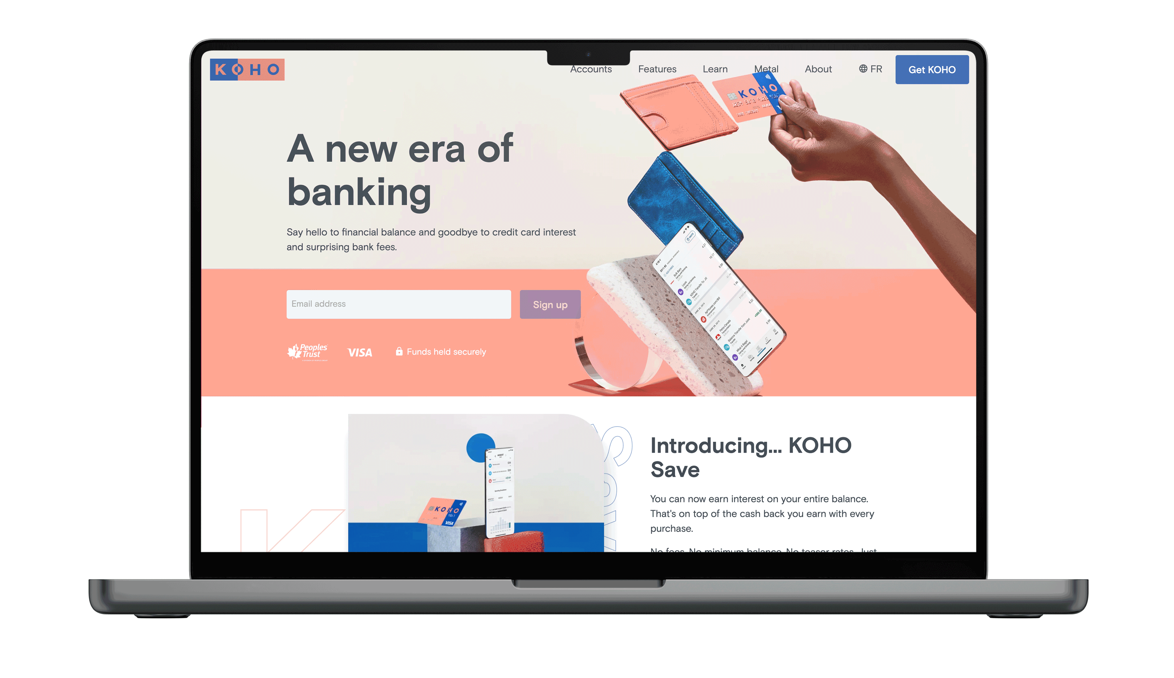
KOHO – Brand Evolution
Established and implemented a creative vision for a national tech brand that supported user acquisition of over 1 million users.
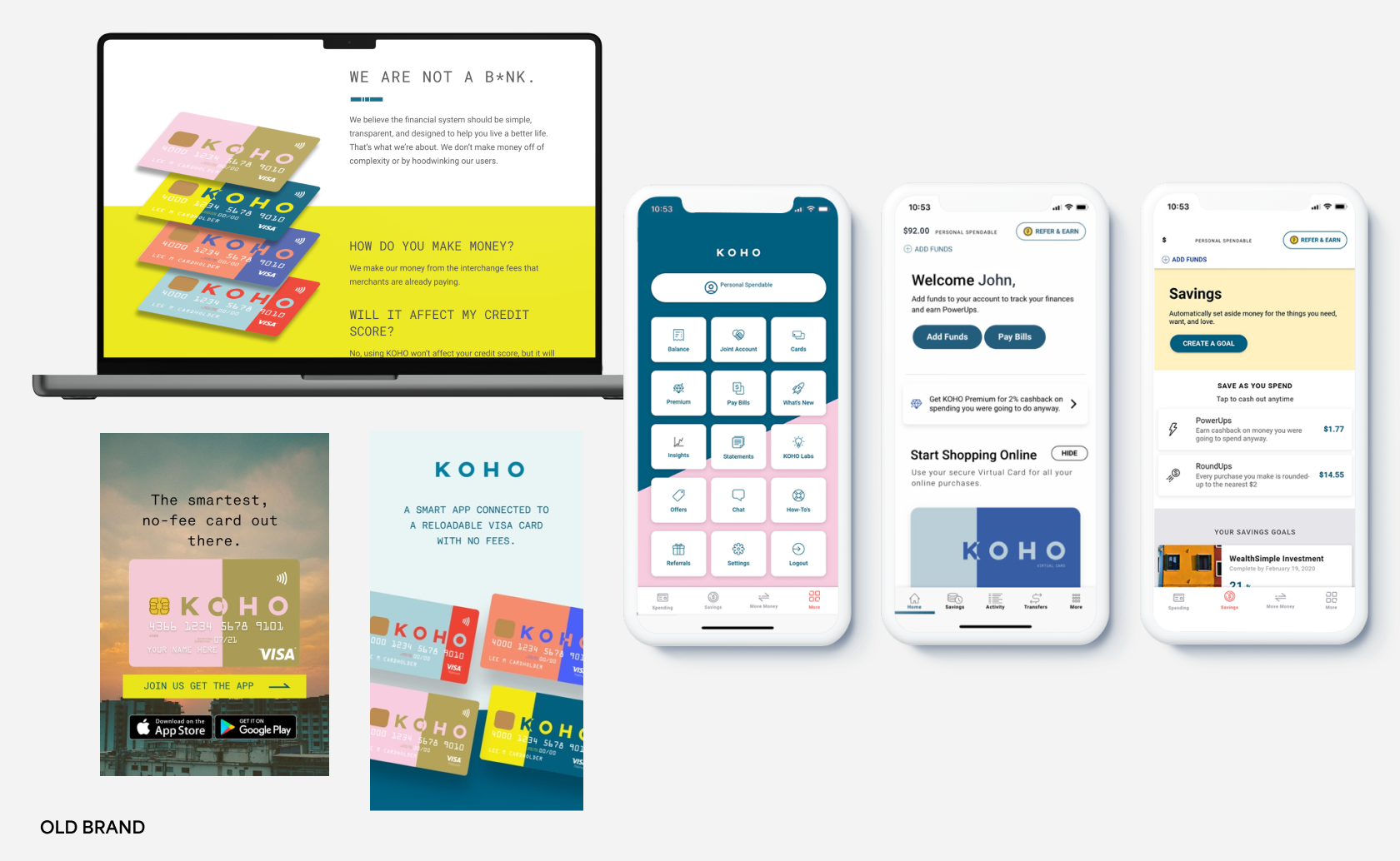
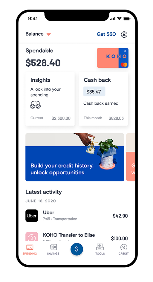
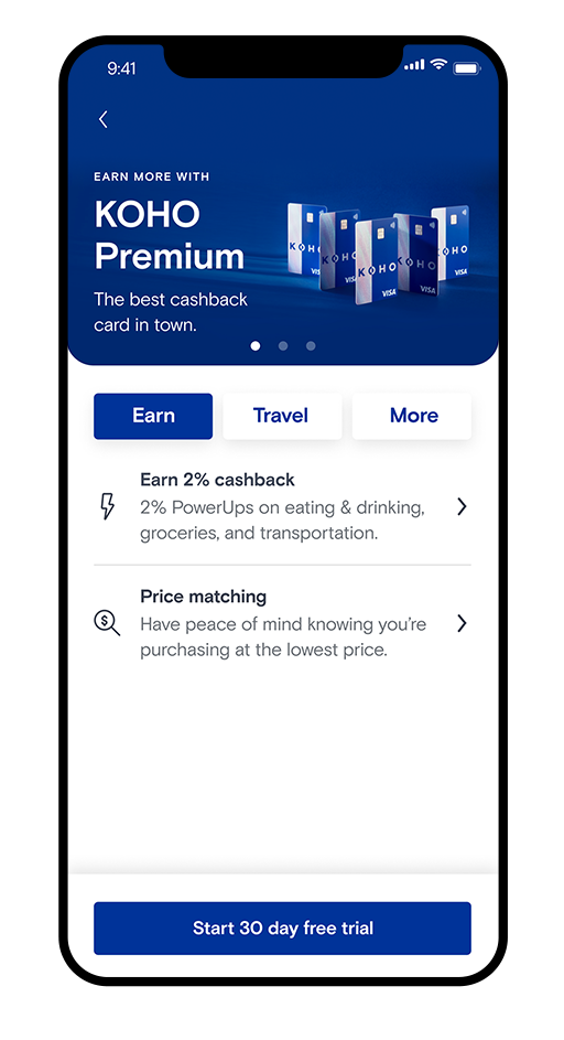
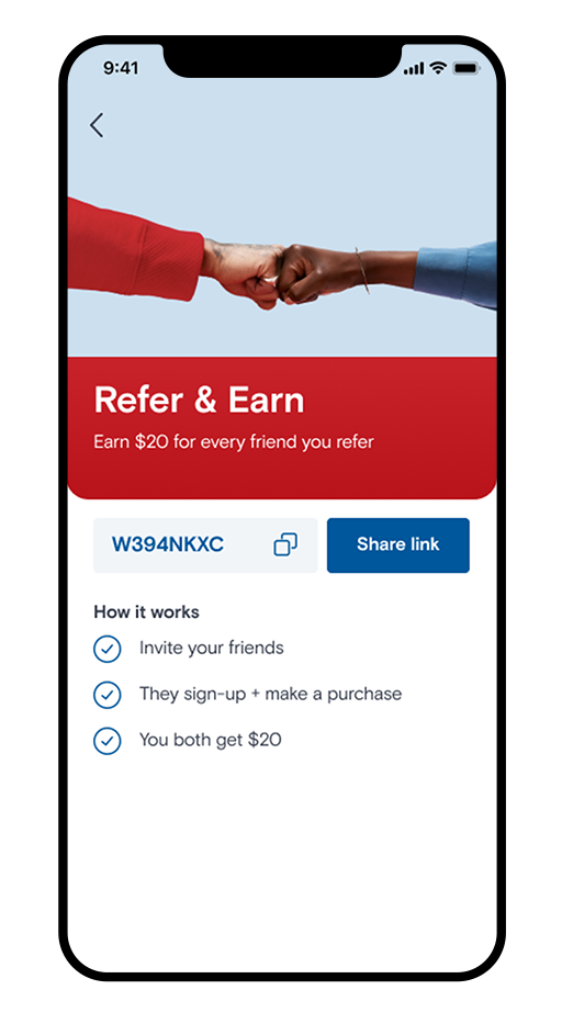
When I firsted started working on the KOHO brand, it was a fresh identity. While a strong foundation working on it day-to-day, it became clear it needed some finessing. The main challenge was cohesion. The brand’s colours were fluid and could be any colour, as long it was a combo. The second challenge was the monotype font. Because of technical and accessibility restricitions, it was was not being used in-app or on the web consistently. This created a huge gap in cohesion across all brand touch points. The last challenge was brand imagery. There was little cohesion here as generic stock imagery was being used alongside bad mockups, illustrations and icons. I created a colour palette with a primary colour combo. Identified a new typeface that we could carry across all brand touchpoints. And created brand imagery and a visual style that was unique to the finance space. These updates have created a unique, and effective brand that has helped KOHO become a leader in the fintech space. You can see the complete brand guidelines here.
DESIGN | ART DIRECTION
FALL 2019


︎Aurora Lynch 2022 — Toronto, ON