PREMIUM CARD
KOHO – Premium Card
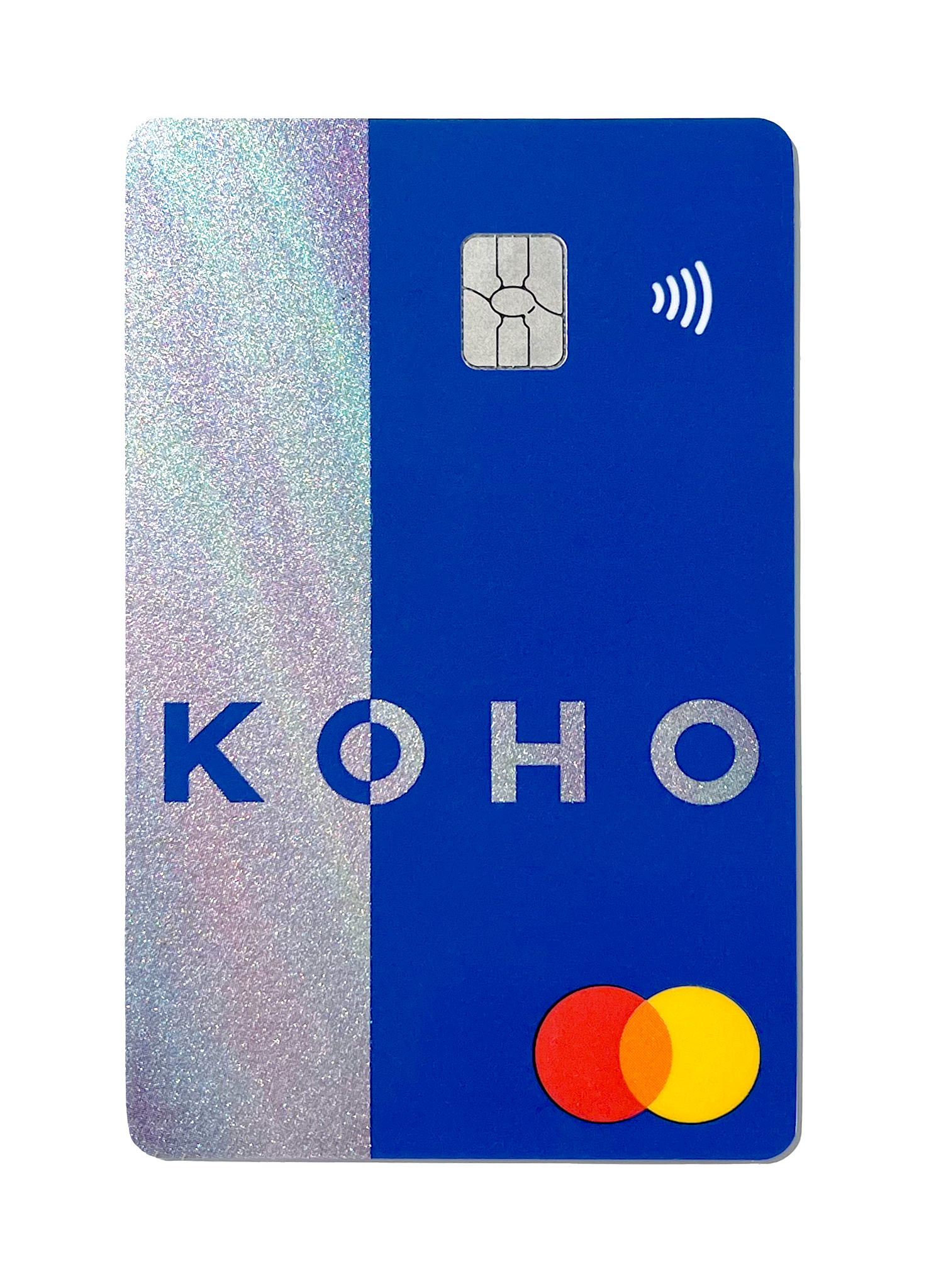
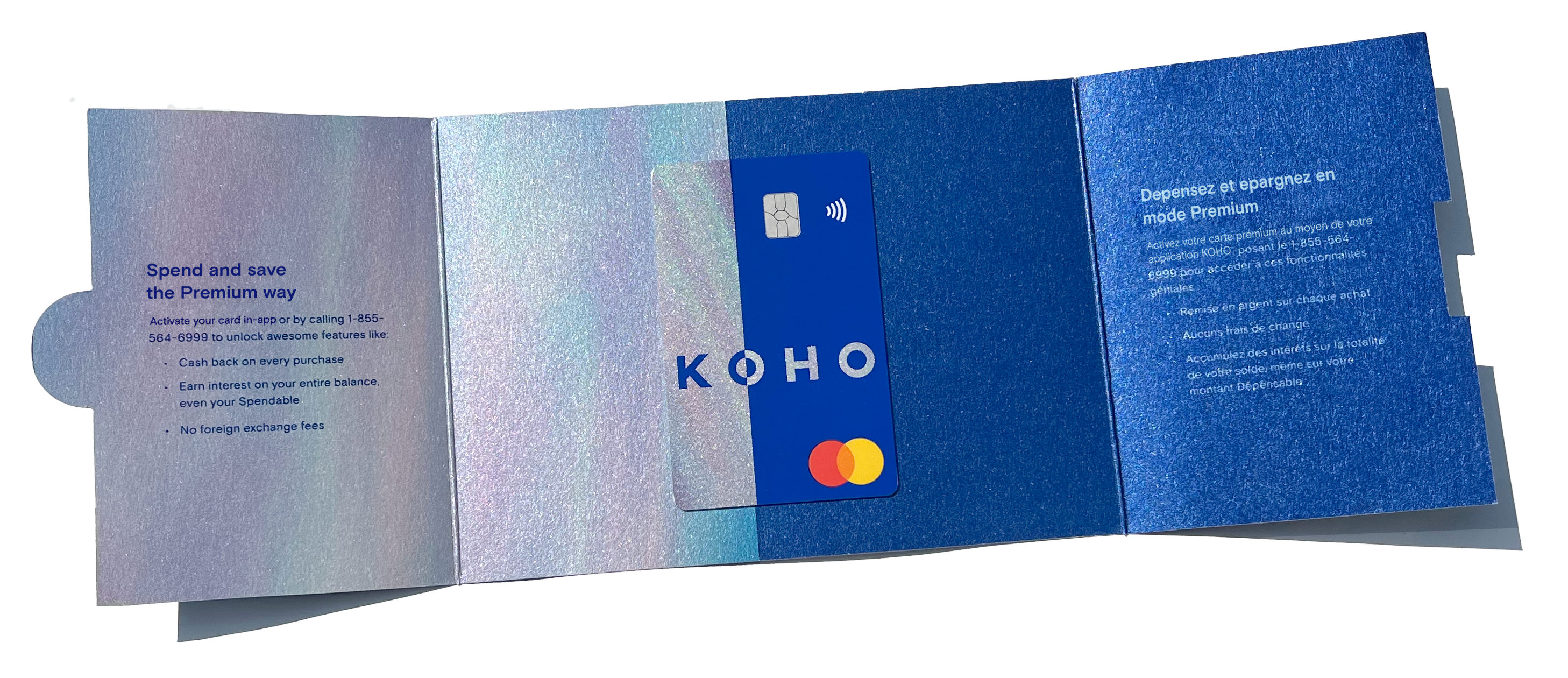
I was tasked with designing a card for KOHO’s new premium product. It needed to have a luxury feel, not skew too feminine, fit within the brand’s standards, and be produced for a low cost. After many samples and tests with the printer, we were able to emulate a pearlescent effect relatively cheaply. At the time, all of KOHO’s (and most cards in the Canadian market) were still horizontal with punched numbers on the front. KOHO being a fintech looking to push the Canadian banking industry forward, it was important that I introduce a vertical card with quick read numbers on the back. The next step was to have the same feeling and effect on the carrier for the card. Again, for a low cost. I utilized our existing design for our card carriers and worked with the printer to source stock that would produce just the right results.
DESIGN
WINTER 2018

︎Aurora Lynch 2022 — Toronto, ON